How to Use Our Site
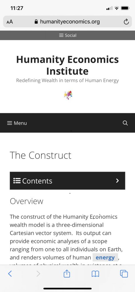
The Humanity Economics Institute’s website is designed to optimally render the content of its model for your ease of use and reading pleasure, regardless of the device you’re using.
Menus: Slender Devices
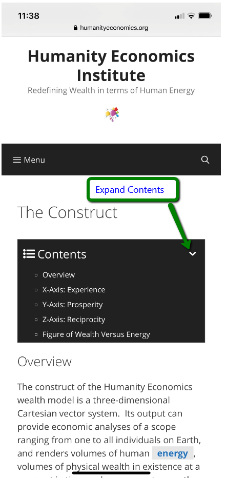
For reading continuous sections of content, our Contents Menu will appear at the top of the page. It will appear by default in a collapsed view state. Click the arrow to expand it, allowing you to easily navigate straight to any desired section:
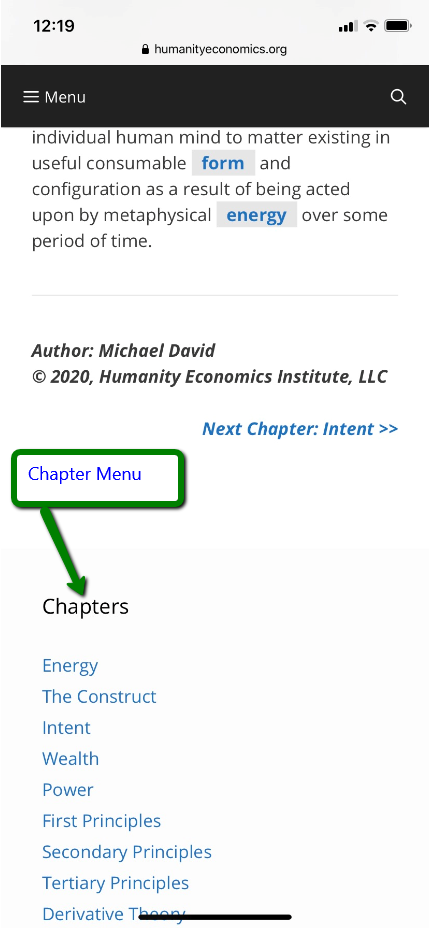
For navigating between chapters of the model, our Chapters Menu will always appear at the bottom of the one you are reading.
Menus: Monitors/Wide Tablets
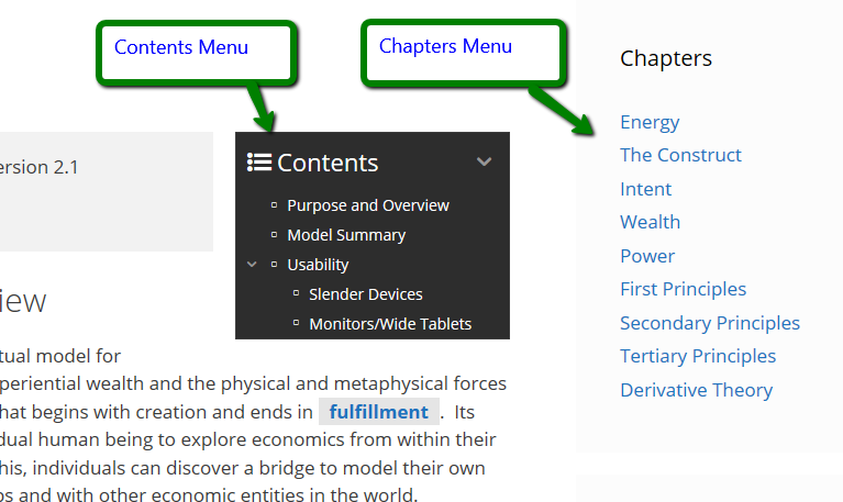
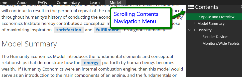
For navigating across content sections on a wide monitor/tablet, our Contents Menu will appear in the top-right-most area of the chapter you are reading. Our Chapters Menu will appear in the right side margin.
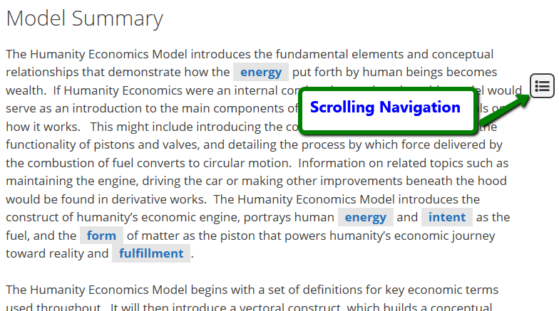
Scrolling Navigation: All Devices
When you are in the middle of reading a chapter on any device, a scrolling navigation menu icon will hover in the right-margin. Click it to open a hovered instance of the Contents Menu for convenient navigation across sections:
Glossary Entries: All Devices
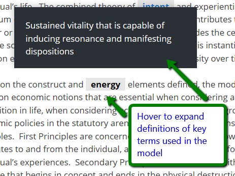
Glossary terms that are significant for understanding the Humanity Economics Model will appear bold with a gray box around them. Hover on them to browse truncated definitions, or click/tap them to navigate to their full glossary entries.